|
Map of deaths from Road Accidents around the World
In this map, the Pulitzer Center, a non-profit journalism organization, represented the number of deaths from road accidents all across the globe. The map was made interactive in order to balance aesthetics and legibility - since the dataset contains a massive amount of information, the data will only be displayed when the user hovers above a selected geographic area. Aside from legibility, this technique also gives complete control to the user in terms of which information they only wish to view, thereby filtering out the unnecessary data and reducing the risk of overwhelming the readers. In addition to roadkill data, the map also shows stories relevant to the country being viewed. They can be accessed by clicking the blue circles available on the map. However, there are some opportunities that can be addressed in terms of how the data was visually represented. First, the visual contrast is not very well-executed. In some parts of the map, particularly in those that have the least number of deaths per 100,000 people, the background is a bit more powerful than the actual landmass. Without looking at the legend, this can be interpreted as either the absence of data (meaning there were no data collected for that region) or the region is simply insignificant. This can probably be improved by choosing a different color scheme that would provide a good contrast between the data frame and the background. Another one is the figure-ground ground orientation, which is relevant to the visual contrast previously stated. Upon looking at the map, the only regions that stand out are the ones that are highlighted in darker colors. It is good, in a sense, because those regions have the highest death counts relative to the other regions. However, it makes the other regions seem insignificant, which should not be the case especially in data concerning the loss of lives. Lastly, the colors chosen to show the magnitude of the death counts do not seem to match the data they are representing. For death counts or similar datasets representing information that are possible causes of alarm, stronger colors should be used such as red or orange, as they attract more attention and more generally connote negatively alarming information. |


|

Maps of the Death Occurrences from Game of Thrones
This map, though 100% real and existent, is a representation of the deaths from an ultra popular fictional book / TV series - Game of Thrones. The story, known as a very brutal medieval war for power, was never short on deaths, and since it could get particularly confusing due to the number of characters and convoluted storylines, the map simplified the tracking of deaths for the audience. In terms of aesthetics, the map is definitely a win, particularly the usage of the icons per kingdom which tried to visualize how each of them was described in the book / shown in the TV series. Visual contrast and figure-ground orientation were also well-executed, as the attention is inevitably directed towards the landmass and the kingdoms on the map. However, in terms of the availability of data, the map falls a little bit short. Without the additional screenshot below the map (which, in the actual article is above it), the map does not provide any information on the data it is supposed to represent. Without it, the map is simply a map of the Game of Thrones Universe - a stark deviation from the purpose it was originally intended for. The article from the page supplements this shortage in data, as it actually tells the story behind the death counts per season, but as for the map itself, it is not capable of standing on its own.
This map, though 100% real and existent, is a representation of the deaths from an ultra popular fictional book / TV series - Game of Thrones. The story, known as a very brutal medieval war for power, was never short on deaths, and since it could get particularly confusing due to the number of characters and convoluted storylines, the map simplified the tracking of deaths for the audience. In terms of aesthetics, the map is definitely a win, particularly the usage of the icons per kingdom which tried to visualize how each of them was described in the book / shown in the TV series. Visual contrast and figure-ground orientation were also well-executed, as the attention is inevitably directed towards the landmass and the kingdoms on the map. However, in terms of the availability of data, the map falls a little bit short. Without the additional screenshot below the map (which, in the actual article is above it), the map does not provide any information on the data it is supposed to represent. Without it, the map is simply a map of the Game of Thrones Universe - a stark deviation from the purpose it was originally intended for. The article from the page supplements this shortage in data, as it actually tells the story behind the death counts per season, but as for the map itself, it is not capable of standing on its own.
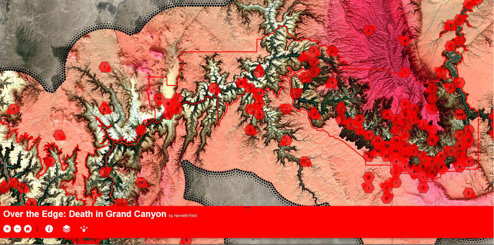

This is another interactive map - one that enables the user to display much more detail on a certain map element when it is clicked. This map, published by ESRI and made by professional cartographer Ken Field, displays the distribution of the deaths in the Grand Canyon, a well-known national park in Arizona, along with details on each death when one clicks on a number. As a professionally created and published map, it employs various technical methods that are beyond my level of skill. One of these if the usage of the Chromasteroscopy technology, a display technique that supports normal viewing but jumps into holographic 3D when a reader uses 3D prism-based glasses. In this technique, the red colors appear closest to the eye, while the blue ones appear the farthest. This enables the viewers to easily distinguish between those that should stand out and those that should fade into the background. Other features are also present, such as an interactive detail overlay, icon changes that provide more details as one zooms in, and various hillshade techniques that highlight the Grand Canyon’s stark elevation changes. As an interactive map, it also has the ability to share and toggle between layers using the buttons below:
The map is already good on its own, but a good addition may be the ability to download the dataset for users who wish to be able to view it in a table form. This way, it would be helpful for other technical users who wish to create their own maps using the same dataset as well.
The map is already good on its own, but a good addition may be the ability to download the dataset for users who wish to be able to view it in a table form. This way, it would be helpful for other technical users who wish to create their own maps using the same dataset as well.
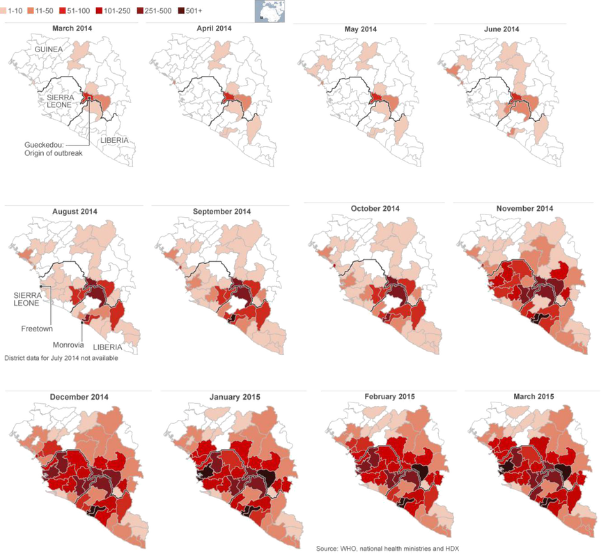
March 2014 - the first Ebola outbreak was declared in West Africa, rapidly making it the deadliest occurrence of the disease since its discovery in the year 1976. This map shows the spread of the disease from its first occurrence in the country of Guinea to the rest of the African continent. One notable quality of the map is its ability to tell a story on its own, even without any accompanying text. The spread can clearly be seen, and the countries that were most affected are obviously highlighted. The color scheme used was also able to communicate the gravity of the situation, causing a response of alarm from the readers looking at the map. The visual contrast was also achieved by not utilizing a background at all, making the reds stand out better. The month-to-month progression and the accompanying change in the dataset were executed in a simple way but were able to tell the story effectively.
As an addition, a good technique that could have been used is to turn the images into a gif. Instead of multiple pictures displayed simultaneously, they could have been put together into a moving picture such as a gif to highlight the progression more effectively.
As an addition, a good technique that could have been used is to turn the images into a gif. Instead of multiple pictures displayed simultaneously, they could have been put together into a moving picture such as a gif to highlight the progression more effectively.
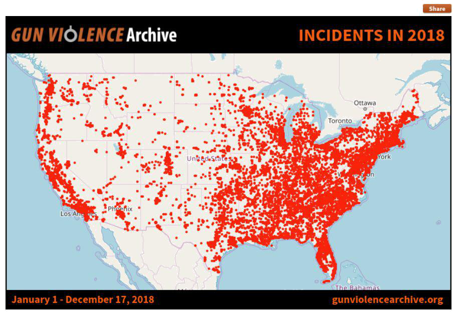
This dot density map represents the distribution of gun-related incidents across the United States from January 1 -December 17, 2018. At a glance, one can immediately tell that the occurrence of gun-related incidents is concentrated in the eastern to south-eastern portion of the country, which is a good characteristic as it shows the map’s strength in telling the story it is intended for. Figure-ground orientation was well-executed, though it can still be improved by using more contrasting colors. The color of the dots was also a good choice, as red symbolizes information that should raise alarms in the minds of the readers. An opportunity that can be addressed in the map is the absence of a legend that would show the numerical equivalent of each dot in the map. A simple statement such as “1 dot = 10 incidents” (for example) could have done the job. This way, the readers would have a clearer understanding of the gravity and magnitude of the situation, now that they are aware of the actual numbers being represented on the map. In addition, the labeling does not seem to have any pattern at all. ‘United States’ is part of the labels, but so are Los Angeles, which is a state, Phoenix, which is a county in Arizona, Ottawa, which is a province in Canada, and some other labels that cannot even be seen clearly because of the dots. The labeling could probably have just been done for the United States as a whole, because in the case of dot density maps, the labels of the individual states would not really be seen anyway.
