There is no doubt that environment pollution has become one of the world’s chief worries, and the place we call ‘home’ becomes more threatened as the days pass. The volume of waste increases every day, and the contributions to environmental degradation come in different forms: solid waste, liquid waste, hazardous waste, and more.
Despite it being addressed in many popular social media platforms and blogs, some people still turn a blind eye on this issue. For this collection, I decided to get maps showing the countries that are considered “toxic” and polluted. There are also maps showing which countries suffer from different forms of environmental degradation, such as those who have very bad air, or those with mismanaged plastic production and wastes, or which river basins have high levels of phosphorus that can be dangerous for marine life.
I have grown a particular liking for nature; aside from the fact that it is where we get our resources for our everyday life, it is something that helps me calm down during the hardest days. As someone who does her part in trying to save the deteriorating condition of the Earth, I want others to do their part, too. I believe in a map’s power to convey a message, and this collection can be a good opportunity to present credible facts about the underlying environmental issues, as well as to help raise more awareness to everyone.
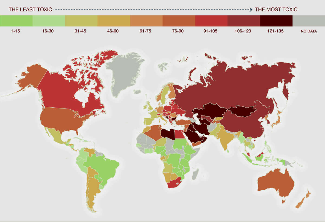
Climate change is still one of the greatest threats the generation today is facing, and it is now important, more than ever, that countries worldwide initiate serious actions to tackle the different issues it has caused in order to save the Earth from catastrophic consequences. The map above shows the most ‘toxic’ countries in the world based on five different parameters: (1) per capita energy consumption; (2) per capita CO2 emissions; (3) air pollution; (4) per 10,000 capita deaths attributable to air pollution, and (5) renewable energy production. The researchers and cartographers, all from the UK-based The Eco Experts, wanted to show the current state of the countries according to the parameters mentioned, as well as to highlight those that need to do the most to limit their impact on the environment.
Africa is a bit divided when it comes to the toxicity of the countries: some remain green while the others have reached the red level. However, there are also parts of it that have no data. It would be nice if there are data for that because it could help in assessing why the levels of the countries in Africa are different. Also, unlike typical maps, the elements of a map (aside from the legend) cannot be seen. It would be great if the other elements such as the title, north arrow, scale bar etc., are present, too.
Overall, the map looks very neat. It is good that the cartographer used the shade of green similar to the shade of leaves to indicate the least toxic countries, and the darkest shade of red to indicate the most toxic ones. Through this wide range of color representation, the distinction between the countries is emphasized.
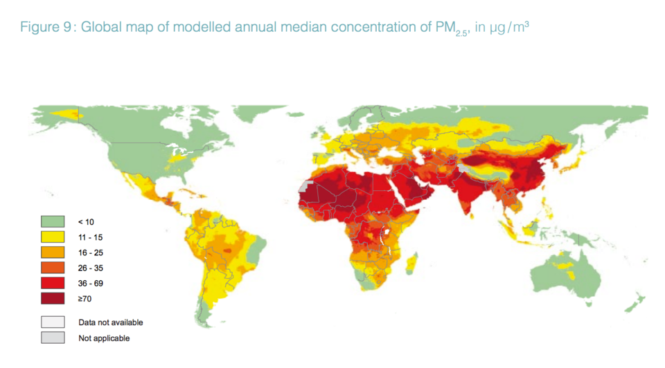
For years, air pollution has always been a global problem; but it is only recently that it got worse than before. According to World Health Organization (WHO), more than 90% of the world population live in places with pollution that goes beyond what is considered healthy. PM 2.5, a particulate matter that has a diameter smaller than 2.5 microns (United States Environmental Protection Agency, 2015) is considered the most harmful pollutant to the health of humans. These very fine particles can be found in smoke and dust, and it is considered very dangerous as it can get stuck in our lungs, causing long-term health problems like chronic lung disease. It started to become a bigger problem when more than 30 micrograms (µg) were found in a cubic meter of air, because its average concentration should be three times lower.
Here in this map, the annual median concentration of PM 2.5 per country is being shown – those that are colored green are within the levels that is considered healthy according to the standards of WHO and those that are colored dark red have a high concentration that is very dangerous for human health.
Overall, the map is very simple. It is easy to understand the message of the map, and the data presented is not complex at all. I believe this is suitable for everyone, as it can be a big help to raise awareness about the current state of our environment. Maybe when people learn about it through the map, people can finally take action: after all, no one is spared when it comes to pollution, even more when it is in the air we breathe every single second.
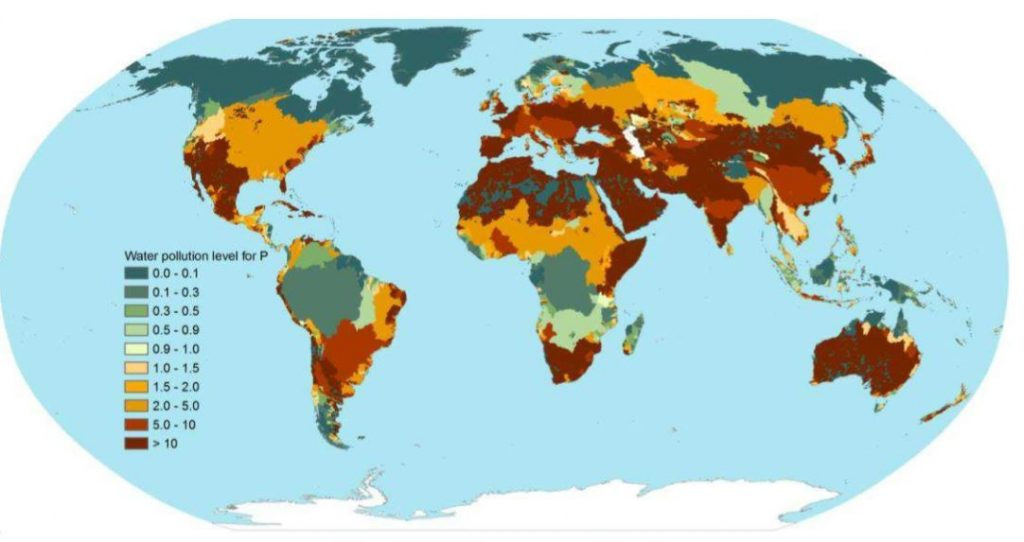
Phosphorus is an essential element for plant life, but when there is too much of it in water, it can speed up eutrophication (a reduction in dissolved oxygen in water bodies caused by an increase of mineral and organic nutrients) of rivers and lakes. This has become a big problem lately, and in a study conducted by two researchers in Twente Water Center in USA, global human activity was said to have emitted 1.47 teragrams (1.62 million U.S. tons) of phosphorus per year, starting 2002, into the world’s major freshwater basins. In the study, water pollution level of the Earth’s major river basins was also estimated by comparing the amount of freshwater to dilute the excess phosphorus with the river basin’s actual river runoff (Mekonnen, 2018). The main objective of the map above is to show the water pollution levels of different river basins, and that if they reach exceed one, they are receiving more phosphorus that it can handle.
I think it is nice that there were data for all countries; it made the map look better in a sense that there is no empty area with a dull color (or no color at all). I like the color scheme used in the map, with the blue green color to indicate the lowest level of water polluton, and the darkest shade of red to indicate the highest level. A strong shade of red color signifies intensity, which is why using red in maps like that is a good idea. Also, aside from the legend, the other typical map elements such as north arrow cannot be seen. It would be better if the most important elements are present so it will look more complete.
This map would be more suitable for those conducting researches about phosphorus concentrations in water bodies, and it would be hard for normal audiences to understand and interpret what is being said in the map. Overall, the map is quite complex, and it would be helpful if this set of data can be mapped in a different way that is more comprehensible.
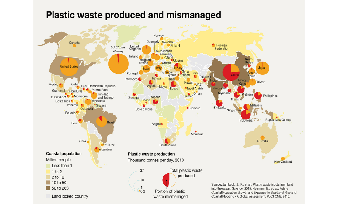
Plastic seems all pervasive and unavoidable. Since the 1960s, our use of plastic has increased dramatically, and subsequently, the portion of our garbage that is made up of plastic has also increased from 1% of the total municipal solid waste stream (household garbage) to approximately 13% (United States Environmental Protection Agency). Another major concern about plastics in the waste stream is their longevity and whether or not they are truly biodegradable. Because plastics approximately take 500-1000 years to break down into organic components (and there is a low rate of recycling), much of our plastic wastes end up in landfills or as litter. Some of these plastic wastes make its way via rivers and wind to the ocean. The main objective of this map made by Riccardo Pravettoni is to show the amount of plastic wastes that are mismanaged and its relation to the growing population in a particular country.
Focusing on the symbology, the legend is complete, both for the population and for the plastic production and wastes. It is good that the color range went from very light, to represent small population, to very dark to represent the bigger population. Also, I think using a pie chart to see the portion of mismanaged plastic waste is good, because it will be easier to see which countries have problems when it comes to plastic wastes.
What I like about this map is it is very easy to understand. I believe that if this map is presented, it will be a big help in raising awareness among people. The places that the author wanted to highlight were also labeled, and it has become easier to comprehend. It is also good that the map author put the sources of his data at the bottom, so the audience can check them out on their own. Overall, this map is very informative because there are two different data being presented in one map and it is not confusing because everything is properly represented and labeled.
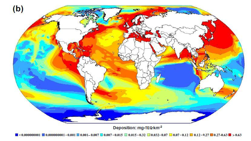
Dioxins are a group of highly toxic chemical compounds that are harmful to ones health. They can cause problems in reproduction, development, and the immune system. They can also disrupt hormones and lead to cancer. Known as persistent environmental pollutants (POPs), dioxins can remain in the environment for many years (National Institute of Environmental Health Sciences, US). This study made by the researchers from University of British Columbia was an effort to identify the most heavily impacted regions of the globe, and in doing so, highlights how environmental issues cannot be isolated on a country-to-country basis, but are a global problem that requires global solutions.
The main objective of the map is to present a global model to see how dioxins travel from source regions and are deposited around the globe. It can be seen that North America, Europe, South Asia and East Asia are dioxin hotspots, and it suggests that oceans are a more significant sink for dioxin emissions all over the world; something that was not expected in the research. Also, the polar regions do not receive much dioxin.
As for the symbology, I think it was well-represented. The color range goes from ocean blue color to intense red, which indicates the increase in dioxin levels. As for the elements, aside from the legend, there is not much present in the map. It is also great that the map was projected that way; even though there is not much to highlight in the polar regions, I think the projection helped in making that contrast between those with high levels of dioxin and those without.
However, this is not the typical map people know and it is also different from what people usually see in maps. I think it is complicated and people might have a hard time understanding what it wants to convey.
