|
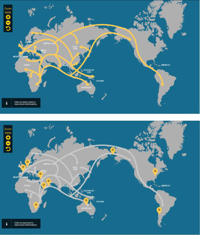
This map is from the genographic project of the National Geographic. The project aims to explore the journey of the ancestors of human civilization, and provide means for people to identify with their regional and deep ancestors. The map specifically aims to show the movement of the first few people that lived on earth. There are two maps included in this article. The first map is very simple, with the arrows depicting the movement of people in warm yellow, a good contrast with the neutral-colored base map. The map is divided in various routes but are combined in one web of routes. When hovered over by the mouse, the map highlights each part of the route. A pop-up window, which appears when the parts of the route are clicked, provides a description of each part of the route: where is it located and what is its relevance on the movement of the first peoples. The second map focuses on the important points of human migration. On top of the routes (now colored in translucent white to blend well with the basemap) are points in yellow symbolized by map pins. A pop-up window providing description for each points also appears when the map pins are clicked. The map is straightforward and doesn’t employ too much information. But it would have been better if it included the variation of routes throughout time to better see how the map routes developed. Other elements of the map that are not that necessary are not present such as map scale, north arrow or map legend. The use of good color harmonies can be easily noticed from the map. The use of labels is also commendable, providing labels only at relevant areas. The simplicity of the map is maintained but is able to provide information needed by the map user for cognition.
|
|
|
|
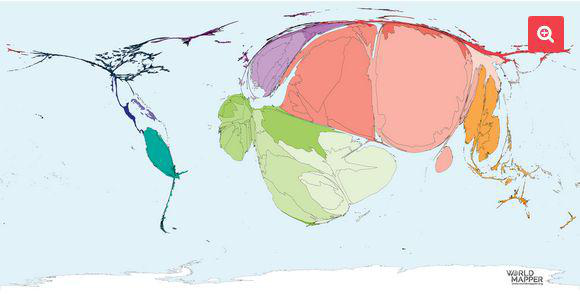
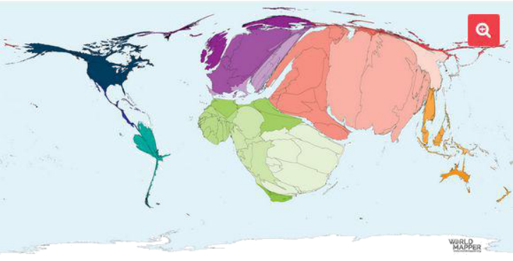
These two maps are cartograms depicting the territory of origin and destination for refugees and people in refugee-like situations. Cartograms are made when a variable of a map (in this case the number of refugees in every origin and destination) is related to land area or distance. Consequently, the size of the countries are distorted but these distortions make it easier for the map user to identify areas with extremely high values. In these maps for example, Africa and the western part of Asia are very distorted and easily attracts the individual’s attention. The downside of cartograms on the other hand is that aesthetically speaking, they are not the best to look at and these maps could have looked better had the map maker used more pleasing color harmonies. Moreover, the map could have been more effective with the use of color psychology considering that the map delves on a topic where people’s pathos can be easily evoked. Other elements of the map are not present as well in these maps. The zoom button is commendable to give the map user the ability to emphasize the areas of importance they would like to see.
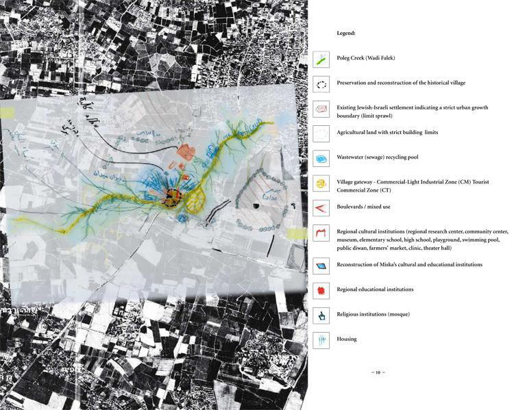
Counter-mapping is a map-making process which encourages communities to create their own alternative maps that are different from the formal maps created and distributed by the government. This allows communities to assert their claims for rights over contested territories. This map is the output of the counter-mapping and participatory mapping project involving both Jewish-Israeli and Israeli-Palestinian participants who were connected to a former Arab village, a Palestinian town that has been erased from the official map of Israel. The objective of this project was to get information from key informants regarding the rehabilitation and reconstruction of the old town. Unlike formal maps, counter maps are not constrained by map elements. Even the execution of the outputs of counter maps vary from one maker to another maker. In this counter map specifically, legends are present to explain the different symbolization and representation used in the output. Pens and yarns with different colors are used to symbolize the different variables. The output was laid on top of a gray-scale, aerial view of the village. My suggestion to improve the map is to use more striking colors that would easily stand out with the gray-scale base map. However, I also recognize the nature of counter maps as something personal and that must be given the more emphasis.
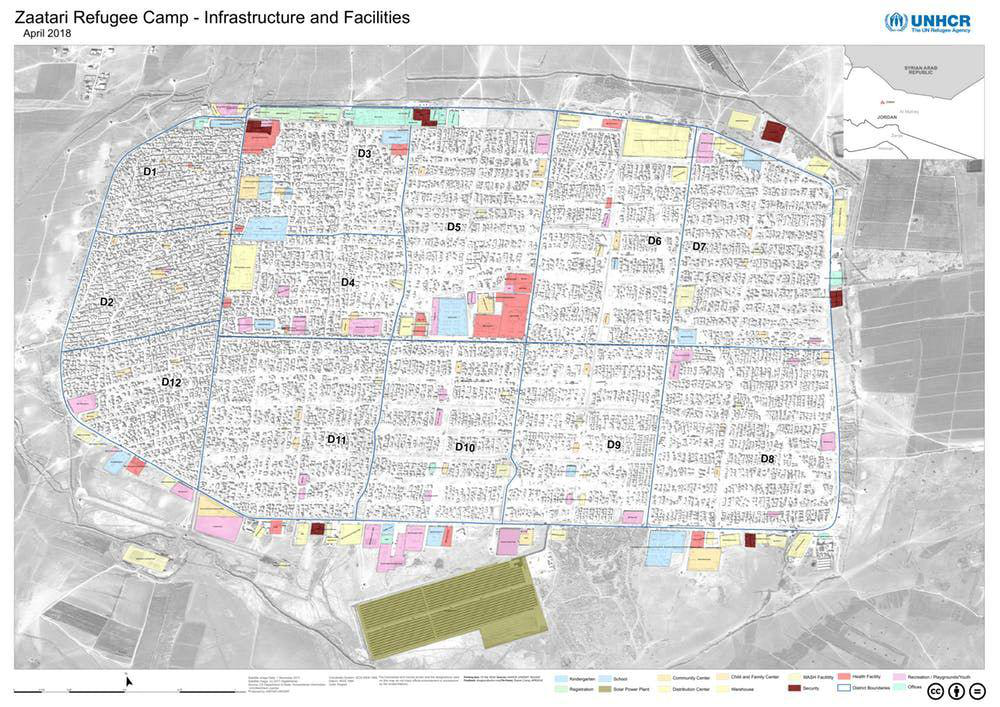
Aside from mapping the area where refugees come from, recent study in countermapping and participatory mapping also involved mapping refugee camps to see the living conditions in temporary refugee camps. This map was spearheaded by the United Nations High Commissioner for Refugees (UNHCR) but was made in cooperation with several refugees who were trained and taught to use GIS in order for them to create a map that may be recognized by other individuals in the academic field. The output created is a professional map utilizing several colors to designate the different areas present in the refugee camp. As they created a the map of their place, they were able to achieve their purpose of visualizing their area as well as learn new skills in GIS which can be helpful in providing them with employment in their new community.
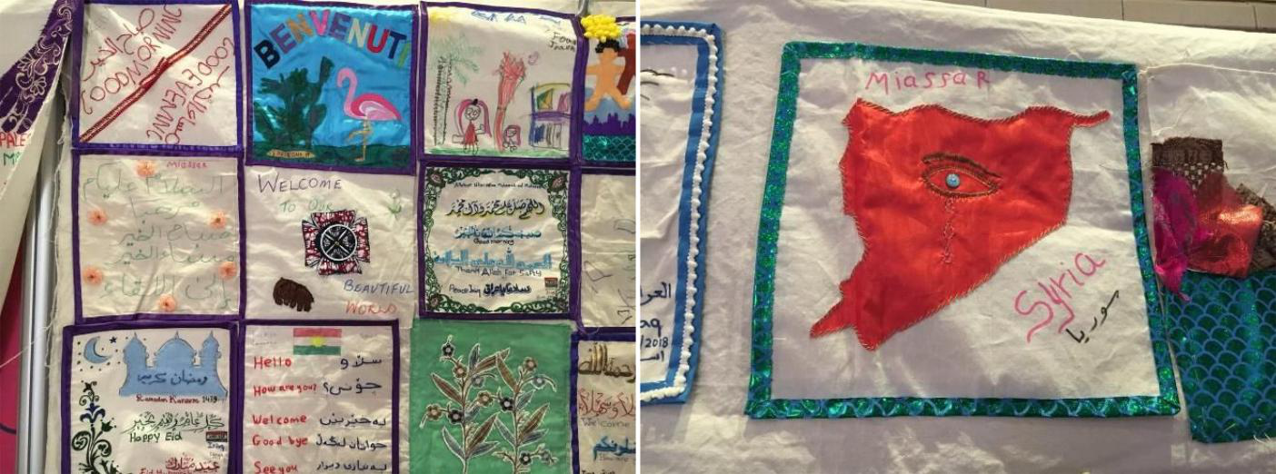
These are artistic maps shown in an exhibit in Refugee Week 2018 at Brighton & Hove. The refugee week is held annually every June. Various events and programs are executed to highlight the impact and contribution of refugees in United Kingdom as well as to develop understanding between different communities in the UK. Art workshops are held during the refugee week, and the artworks made by the refugee participants were displayed for exhibit. Some artworks are displayed on the photos. Each participant was given square tapestries for them to serve as canvass of their artworks depicting the places where they came from. One of the more striking artworks depict a map of syria in red, crying. Artistic maps are very pleasing to the eyes while depicting symbolisms and insights about the issues, in this context, of refugee immigrants. It does not contain hard facts and information about the place like formal maps do but it still provides a lot of information and insights about the place being described, even though on a more humanist aspect. This kind of map is very personal and does not include the common elements found in formal maps.
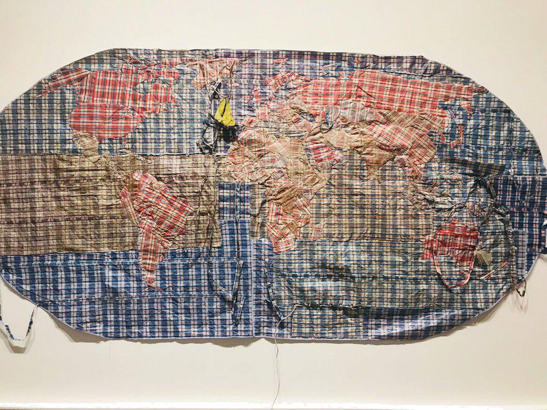
The picture above is another example of an artistic map. The map was made by weaving plastic bags often carried by refugees as they get displaced from one place to another. When it comes to artistic maps, the map becomes a form of art and thus, symbolisms and meaning are attached to the map. It is commendable that the map maker made use of an object that is often used by refugees and is easily identifiable giving the map reader an instant recall once they see the map/artwork. The use of plastic bag that is very mundane somehow provides additional meaning as well to the refugees who use them. Artistic maps, as mentioned previously, focuses more on the meaning and the feeling the map provides and not contain the usual map elements.
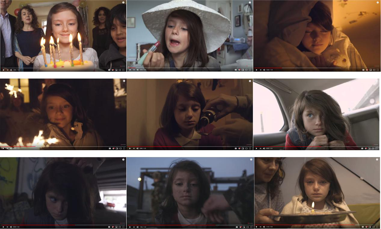
This short film was first released on Youtube by Save the Children, an international non-government organization that aims to promote children’s rights and provide relief and support to children in developing countries. I first saw this video when it circulated on different social media sites gaining countless shares and retweets. What’s striking about the video for me is how it shows so much change in landscape in less than two minutes. There is a growing study on what was referred as “Cinematic Cartography,” a study that looks at how locational properties are attached in moving images contained in films. In this example, despite it not being a “map,” insights about the changing landscape can be drawn from the video. This shot film is in itself, just like a map, a representation of the changing landscape individuals experience in war-torn Syria. Moreover, the girl can be represented as the scale of perspective used in the map. The map is limited to the experiences of the girl in the video. The changing landscape serves as the stimulus for communication. At the end of the thought-provoking video, you are automatically made aware of the changing inhumane landscape individuals are experiencing. Like a map, it was able to communicate the message it aims to portray, and that is to show the experience and conditions of displaced refugee in war-torn areas.
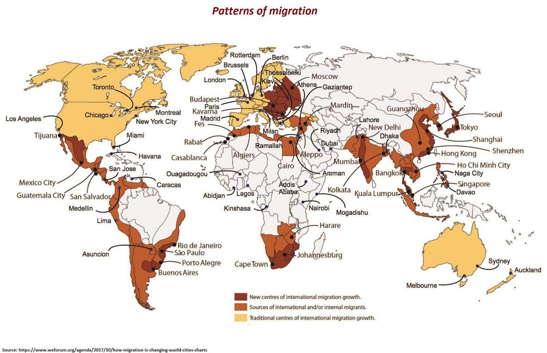
I retrieved this choropleth map in reddit (an online discussion website). The map above aims to show the changes in world patterns of migration. It illustrated the new and traditional centers of international migration growth, and the sources of international and/or internal migrants using different shades of brown. The visual contrast of the map is commendable, particularly the use of contrasting colors. The use of labels and points to show the notable places in each country is a good way to provide more information about the maps. Visually, it was well executed with the labels positioned mostly outside the map preventing the map to be too overcrowded and still be legible. In general, the use of choropleth classification in this map is properly utilized in providing the basic information needed to achieve the purpose of the map. Only the map elements necessary for interpreting the map such as title, legend, and source are present in the map. For me, the is really commendable because adding several unnecessary elements such as scale or north arrow, that are not really necessary for interpreting the map and achieving its purpose, would have only made the map more crowded-looking.
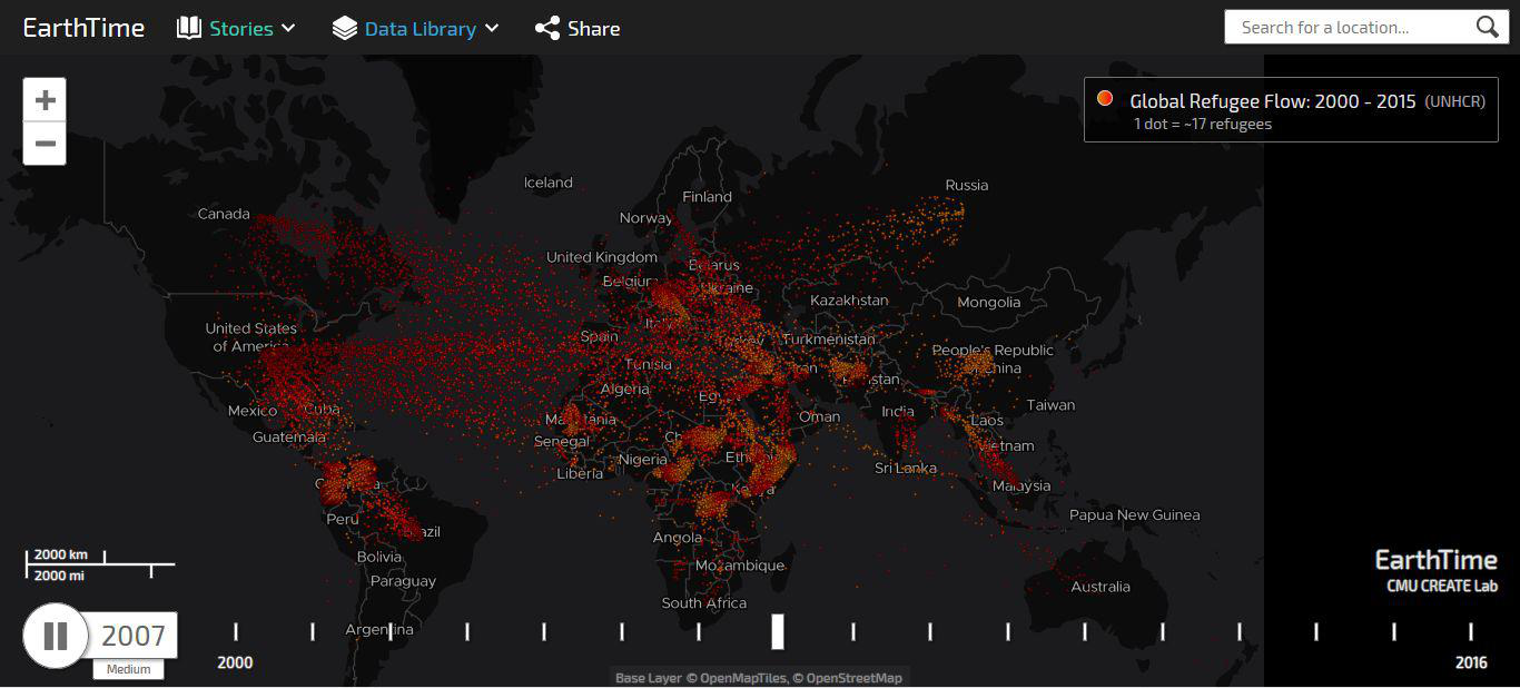
This is a screenshot of first of the several interactive maps about migrants and refugees. This map in particular shows the the movement of refugees worldwide in recent years. What I find commendable in this map is its attempt to include many different variables in the map namely the dimension of time, the amount of migrants, the changing colors depicting the shift from emigrant to immigrant. However, due to these several variables present in the map, maintaining good visual contrast and legibility could be at stake. The use of monochromatic palette for the basemap and the background provides a good contrast with the orange-red contrast of the points. Unfortunately, the shades of orange and red used in the map could have been altered to more vibrant and bright shades to stand out more from the base map (especially the red shade which almost look too close to black, a poor contrast making it not stand out). Moreover, the legibility of the map was greatly affected negatively by the use of moving dots instead of graduated dot map which could have been a lot easier to interpret and understand. In general, although this map could still be improved, it was able to achieve its purpose.
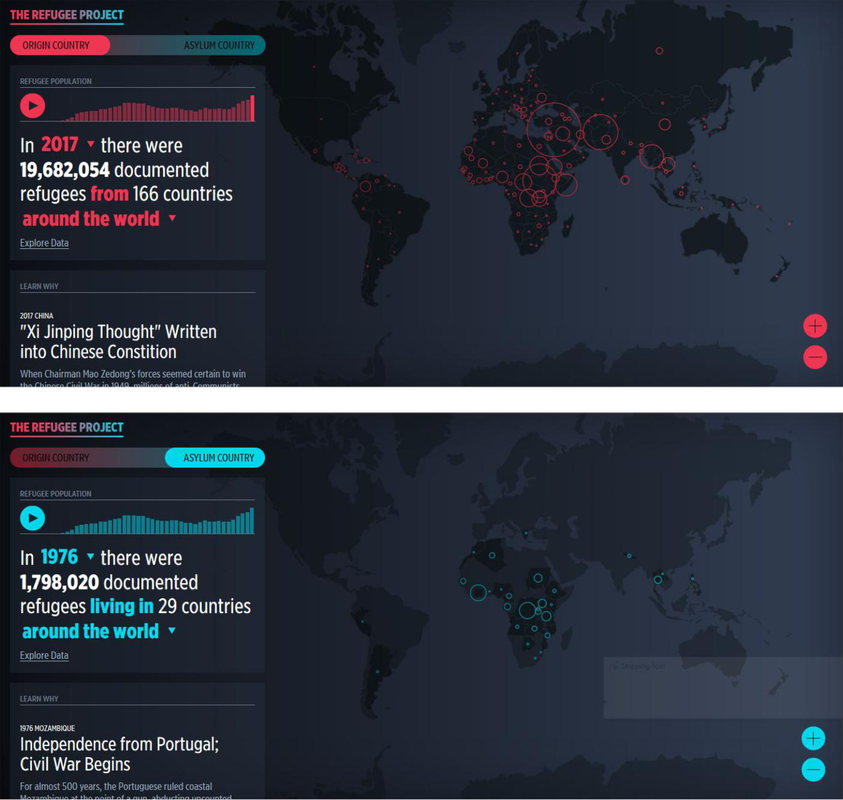
This map is another interactive map showing the trends of refugee presence and movement worldwide. The key distinction of this map to the first interactive map is the division between origin country and asylum country. The map maker utilized graduated dots to show the varied amount of refugees presence in each area around the world. The visual contrast of the map is so much better in this map compared to the first map. The use of color psychology in depicting the origin and the asylum country is well executed as well as the choice of color shade utilized to stand out in the monochromatic background. As mentioned earlier, the use of graduated dots makes the map easier to understand and interpret for the reader. Another key distinction of this map is the “learn why” section of the map located below the “refugee population” window. This allows the reader to read related articles that may help him/her understand the refugee movement occuring in that specific time and place. The “interactive” aspect of this map is also more pronounced because the reader can pause and play the map, go to the specific time and place (or scope of the map). In general, this map is easier to understand and more interactive. The purpose of the map is achieved very well.
