earthquake vulnerability of buildings: Quezon City
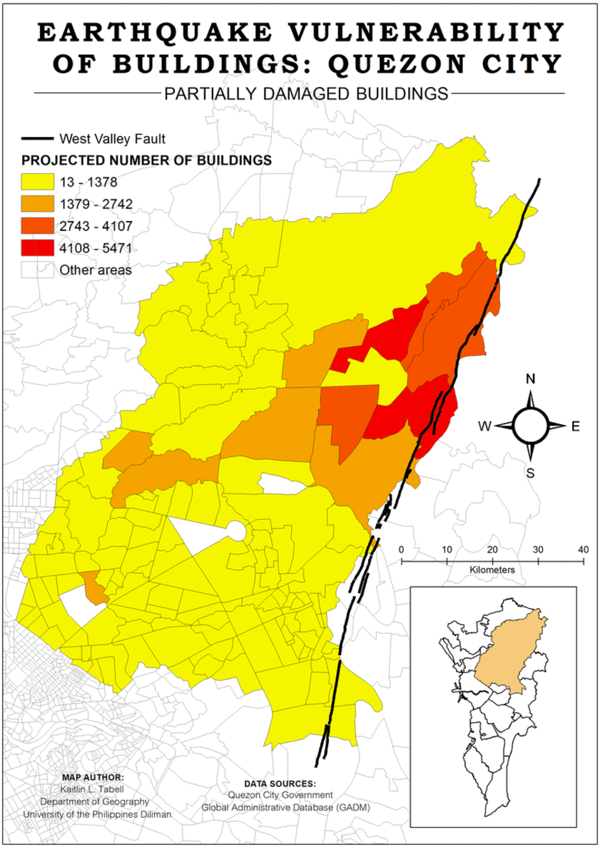
This series of maps entitled “Earthquake Vulnerability of Buildings: Quezon City” shows the projected number of buildings that will be damaged (and will collapse) when a 7.2 earthquake hits Metro Manila. The main goal of having these maps, although a bit far-fetched because the maps are lacking in many ways, is to be able to identify which areas (barangays in particular) have many buildings that will be damaged in different levels due to their structures. This way, the government can do something to prepare for it – informing the people, encouraging the people to rebuild, or maybe coming up with programs where they can provide loans to the poor so they can renovate their houses. In the cases of commercial buildings included in the projection of damages, the government can try to rule out cancellations of businesses to force the owners to leave, and if they want to stay, they must renovate the place for it to be strong enough.
The data I collected was directly from the Quezon City Government. I was able to get in touch with them through my father, who works in the field of disaster management. The data set I obtained provides the total number of buildings in each barangay in Quezon City, as well as the projected numbers of buildings that will be damaged. There are 3 classifications according to how damaged they will be: partially damaged, heavily damaged or very heavily damaged (which may soon lead to collapsing). However, the data set only has numbers, which means there is no indication of what and where the exact building is. Because of certain limitations, I made a series of choropleth maps showing the projected number of damaged buildings in each barangay according to their classifications. A higher projected number of damaged buildings (and buildings to collapse) yields a darker color for the area.
Since the beginning, I wanted to do a map that could be very useful. I believe maps are a good way to disseminate information and raise awareness about certain topics, which is why I wanted to use the opportunity to tackle a quite heavy topic: earthquakes and hazards. My original concept note included the making of a vulnerability map of identified poor households in Metro Manila, but due to lack of data source, it changed into an exposure map of Quezon City where I would be mapping the buildings that are very close to the West Valley Fault. I also received comments and suggestions from my professor and a mentor on how to execute it but in the end, I found it hard to map it; maybe because the real goal of my map is very vague, even for me. I ended up with a series of very simple maps that shows the projected number of damaged buildings in each barangay in Quezon City, which is still related to the topic I wanted to do, albeit just a part of it.
Cartography is not as easy as it seems, but it is very fulfilling to learn about. It has become another way to communicate to people, to convey a message for others to further understand. If I were to give an advice to a beginner mapper, it would be to not give up. The entire process of gathering data and making maps requires hard work but everything is worth it in the end: the new information you learned about through data gathering, your tested patience, and the nice and clean output you will come up with after. Also, do not forget to study the color patterns and which color goes well with which!
