Real estate in the Philippines has been competitive over the years. Condominiums and subdivisions compete with each others in different aspect such as quality of houses, functionality and convenience. One of the most competitive areas in real estate is the advertising and marketing. Prints and magazines allot spaces for real estate ads. Commonly, a map become an added feature to persuade people with the amenities and nearby utilities. It shows how strategic location of different considerations influence one’s choice - convenience, accessibility, safety, privacy and services available.
According to the Texas Department of Transportation Glossary, a vicinity map is a key inset of an overall view of a generalized area on the map (2013). It illustrates the 'vicinity' of whatever-it-is you are interested in - your town, your neighborhood, the area around. The site must be clearly marked and shown in relation to different considerations relating to the purpose, function and utility.
Location maps are specialized maps dedicated to finding a specific location, showing how to go from here to there in the clearest possible way, with information directly relevant to a specific journey such as recognizable landmarks, points of interest, roads and any other hint helpful along the way. It is a stripped down version of a normal map because there is no need to show every road in the area, only the ones leading to the intended destination.
This collection aims to assess how marketing and advertising influence different elements and presentations of maps, as well as how maps are used to successfully persuade the audience. Vicinity and location maps are influenced by one’s activity, purpose, preference and utility and is mainly anchored to the person/group’s bias and points of interests. Maps in this portfolio is therefore categorized into residential, recreational, industrial and institutional.

Fortune Hill San Juan
Fortune Hill San Juan is a residential condominium by the Filinvest Premiere located near the central business districts of Makati, Ortigas and Quezon City. Located in the corner of P. Burgos and P. Gomez Street, Fortune Hill is placed in the middle of the map, complementing their description of being the belly of the dragon in the feng shui philosophy.
The map is grayscale except the site, highlighting itself. Like the other vicinity maps, while it highlight several structures and institutions, there are structures that are not considered as part of their vicinity. It only highlights a few major roads and streets that are entry paths to the site. Major roads such as the Ortigas Avenue, EDSA, and Shaw Boulevard were shown indicating the accessibility of the site to the said CBDs. The map uses iconic symbols to represent nearby features such as the graduation cap for schools, bag for shopping malls and others. Noting the presence of the North arrow, the map can be said to be not oriented towards North direction. Moreover, the map does not include a scalebar indicating that the distance is not a primary concern but the structures and institutions nearby.
The objective of the map seems to be for aesthetic purposes to persuade the audience looking for a new flat to check their site, emphasizing on the different establishments nearby for convenience. They may be successful in showing what they offer as there were schools shown nearby, hospital, cemetery, and some leisure places. The map is targeted to those people working nearby Quezon City, Makati and Ortigas as they emphasize the accessibility and connectivity by showing only the roads connecting to them.
This map was taken from the estate’s website. What is interesting in the map is its effectivity to market and sell its property by putting everything on monochrome except the condominium standing out. There are no transportation terminals or stops shown in the map which leads to the idea that the community is either accessible only by private cars or not a commute-friendly community - therefore assumes that every property owner has a private vehicle. It is noteworthy that basic services needed are shown to be nearby however some improvements should be considered such as locating a church as one of the basic needs, transportation stations in case of emergencies, and an inset map to provide a larger outlook of the area. Legends, besides the symbols can be also utilized to well represent each features not present in the map that are worthy of being shown. It may also help potential buyers if they included other areas and landform elevation in the map. The map also followed the convention in putting label in roads and points by capitalizing names of roads inside the polygon.
In general, the map projects and emphasizes the neighborhood/community rather than the property itself.

Filinvest Homes Butuan
Filinvest Homes Butuan is yet another real estate property that aims to persuade families and individuals who wants a modern living with the mixture of the city and nature. The ads want to appeal to those who already have a house but wants to transfer for an improved setting. Located in the Barangay Baan, Butuan City, the property features not only its facilities and amenities such as swimming pools, clubhouse, playgrounds, picnic and landscape parks, but also its neighborhood as shown in the map.
The map was uploaded and can be accessed in their website. The map is very clean and was able to clearly locate the property as it is labeled with distinct color, with an arrow emphasized and labeled by their logo. The most interesting point in this map would be the choice of color as it used bright and eye-catching colors, effective in grabbing the attention of the reader. Another strategy they used was the vision line test wherein the scale of the projected area shows the property in a very clean and emphasized part of the map within the vision line. It is notable that the map featured only two major roads, and it utilized the natural features and barriers in the map such as the river and bridge, as a factor of choice of the buyers. Just like the other vicinity map, some features were not projected. It used points to locate the places and services that are accessible and available nearby like school, hospitals, church, and police station. The site was effectively shown as a polygon with distinct color, standing out from the crowd. There is a compass indicating directions and orientation. And just like the other vicinity maps, the map shows and assume a flat surface.
As seen in the map, the company focuses on the basic services needed by the potential buyers such as education, religion, health, and safety. However, not included in the map are entertainment and leisure spots, however, it is indicated in their website several features inside their real estate property like a swimming pool, clubhouse and others. This would mean that the main theme of the property is taking care the house owner’s well being by providing leisure services within the location.
The property lies along the road going to Davao City, catering to homeowners that needs a direct access route to Davao City. Road names also follow the convention on labels as it is capitalized inside the polygon, however the labels of the points do not follow the convention. The overall look of the map shows that it really wants its property to stand out and get the attention of the potential buyer rather than emphasizing the community and the services available.

Asteria Residences Paranaque
Asteria Residences Paranaque is a medium rise residential condominium that aims for a secure community with access to several places of interest and of the dynamic lifestyle in the South of Metro Manila. This 2.7 hectare property is owned by DMCI Homes located in Sucat, Paranaque with 7 buildings and 6 floors each building. According to the website, where this map was taken, the residences aims to look for homeowners like starting families and young professionals near Paranaque, Muntinlupa and Las Pinas.
The map used a monochromatic color for the roads and other points of interest, while a polygon with green and trees to emphasize the property. The map is oriented in the north as being shown by the compass/arrow, to which lessens the abstraction in direction and orientation. It used a white background and failed to include several other features including the terrain, thus it looks like a plain area. Iconic symbols such as logos of the company, building and airplanes were used as points to indicate services nearby. Based from the map, it is interesting that it can be effective in persuading homeowners that often travels, working professionals and value its leisure and wellbeing as it mainly features the accessibility and proximity of the property to the airport, casino and hotels, shopping malls and central business districts. Just the usual, it followed the convention on labelling the roads and on the points, however it failed to label the property itself making it hard for the reader if it only see the map itself -- you cannot know what property it is through the map alone.
In general, the degree of persuasiveness of the map is not that much however it successfully emphasizes the services taken into consideration by the target audience.

Havila
Havila is a town-type residential community of Mission Hills, Highlands Pointe, Forest Farms, Villa Montserrat, and Anila Park. Located in the most part of Rizal - Taytay, Antipolo and Angono, it emphasizes its proximity in the Metro, to the services and modern conveniences such as schools, central business districts, leisure, commercial and medical services, and access roads to outlying areas for travel. It mainly aims to appeal to audiences who wants a suburban living while near to the basic services needed.
Checking the basic elements of the map, it uses a white background that elevates the features with green, yellow and orange colors. Oriented in the north as to the presence of the north arrow. It features the physical and natural features and barriers such as the river and Laguna de Bay. They used green for their road and a distinct color orange for the points locating different services and amenities. Labels are according to the convention; however some features are not projected as maybe are not considered to be the interest of the developer. It used points instead of icons as symbols and the labels does not overlap any boundary. The map projects a smaller scale of area as it tries to show the proximity of the property to Metro Manila where people usually go to work.
According to their ad, it features a suburban living with a safe, secure and flood-free community. What’s interesting in the map is that it was able to convey their purpose of showing what it is really they promote. The property itself features the landscape and terrain emphasizing that it is in the suburban and in the higher ground however limited only to their property. Another important and interesting to note in the map is the road. C6 Road, Ortigas Avenue and Marcos Highway were colored yellow as to emphasize the roads that gets busy and traffic going in and out to Metro Manila.
For a vicinity map, this map by Filinvest would be the most effective in showing its features, amenities and its proximity to other areas.

Grass Residences
Grass Residences is a residential condominium developed by SM Development Corporation that aims to complete the urban living and landscape that complements the SM North Edsa. The property focuses on promoting the urban lifestyle in the North of Metro Manila. Its audience are families that values leisure as to its proximity with the shopping mall and those who are going or who wants to be near Monumento, North Avenue, Makati, West Avenue and along EDSA.
The map was obtained in a booking website and thus not official. Assessing the map, it is very interesting that it used 3D polygons to emphasize the site, unlike the usual flat surface vicinity maps. The roads are correctly labeled, capitalized inside the polygons and those outside are not. It is also interesting that the sizes of the road differ according to the volume of traffic and cars.
Major issue with the map is the absence of a compass or north arrow. Although it is said to be located in the North of Metro Manila, the absence of the compass or north arrow misleads the audience of their direction as well as orientation. It may be effective to promote both the residence and the mall as it only shows that having only those two distinct sites in the map means everything you need is within those places. However, there’s too much highlight of the property and the shopping mall that other services and amenities were not shown in the map such as the nearby schools, churches and other government and public services.
Personally, the map may successfully persuade individuals who value only the leisure of shopping and urban home, it fails to appeal to the general public/audience as it lacked to show other several considerations in choosing a residence.

Stilts Beach Resort
Stilts Beach Resort is a recreational resort along the coasts of Calatagan in Batangas. It is a 24-hectare property including the beach and other activity areas, that features the breathtaking sunrise and sunset, cozy cottages, and flowers and organic gardens that will connect you to the nature. Their target audience as shown in the map are those people from the metropolitan having the South Luzon Expressway highlighted as the only major access road to the property. It caters to the audience that look for places for recreation, getaway, corporate events and special occasions. Recreational activities such as biking, volleyball, pony rides, watersports and teambuilding activities emphasized the exclusivity of the location.
The map assumes a flat surface and as the others, excluded several features such as elevation and other infrastructures. In terms of legibility, the map can be readable however only the roads were given highlight and there is not much of a distinction with other landmarks. The map used points as symbols – gray for other needs and red for the beach resort. Other colors were able to highlight the map itself and the other elements do not obstruct the map also. The roads that are colored in black shows the other roads that might be encountered but is not the correct route towards the resort. The map used and colored the route red to show which roads should be taken considering the Tagaytay Rotonda as the origin. The map also shows the exact distance of each road segment. The map is very thematic with all the illustrations giving a very recreational vibe and balances all the spaces available.
The most interesting points in this map are the featured infrastructures. The map only shows points such as gas stations, other resorts and hotels that might be encountered along the way and the shopping malls to shop, church and the administrative (municipal) hall. It only shows that the developers put on the bias of guiding the audience while thinking their needs while travelling such as groceries, gas and to avoid from getting lost into other resorts.
Generally, although the map might appeal as something recreational, but its overall presentation does not directly depict a beach resort thus, does not directly serve its objectives. Moreover, the presence of unnecessary illustrations only depicts the inefficiency of the use of space in the map.

Alta Vista Golf and Country Club
Founded in 1994 and was developed by the Santa Lucia Realty and Development, Inc., Alta Vista Golf and Country Club is located Pardo Hills in Cebu City and is not only home to the 60 hectare property for golfing and a country club but also to other recreational activities with their facilities such as basketball courts, ballroom, pool, tennis court, and teambuilding field area and residential cum leisure development of more than 400 hectares wide.
The vicinity map features a theme of a golf course as it used a golf ball as the background of the map. Unlike other vicinity maps that uses a straight lines and polygons for roads, this map shows the exact road to be taken as shown to be like in a zigzag. The location is also well shown in the map as it is emphasized by a green turf background with their logo and labeled name and used points as symbols to indicate other features. While limited features were also included in the map, major roads to be taken going to the golf course, and some landmarks such as the university were indicated. The bias of the developer also shows from the features available in the map such as the gas station and public market to which in case of emergencies are convenient to the audience.
Thematically and visually, the map has a good balance and color choice, points and labels are legible however, the lack of north arrow and scale bar gives an abstraction to distance, direction and orientation of the map.

San Beda College Alabang
San Beda College Alabang is an educational institution located in the middle of the Alabang Business District. It is a private college affiliated with the San Beda University, a Catholic university. Their college mainly offers programs in law and performing arts.
The college’s vicinity map featured in their website is themed with their university color, red. Their campus is being highlighted through their logo. In terms of readability and balance, the color choice of the background makes it hard to read. The background itself overpowers the map. It is interestingly indicated in the map the route from the major roads of South Luzon Expressway to their school through the arrows. The arrows however assumed that the audience are students coming from Manila area. The map features several roads and landmarks such as malls, hospitals, banks, gas stations, and nearby residential areas which caters the needs and convenience of the students. The polygons and lines also failed to emphasize the difference between infrastructures and roads as the map is shown in a flat surface with one color except the school’s logo.
As someone who have never been to their school, although “to Manila” and “to Batangas might help for the direction, there still lack a compass and scalebar to indicate orientation and distance especially from the SLEX. In terms of the labels, names of roads and structures are labeled inside the polygon however are not capitalized. Overall, I think that there is a poor execution of the vicinity map and failed to show its objectives, other than showing the location of their school by the stand out logo.

Industrial Technological Development Institute
Department of Science and Technology
Industrial Technological Development Institute is a branch under the Department of Science and Technology mandated to develop science and Technology in the Philippines, multidisciplinary industrial R&D, technical services, knowledge translation and technology transfer. This institution based their office, as shown in the map, along the Gen. Santos Avenue in Taguig.
The vicinity map available in their website being an institution of science and technology has effectively shown their location through a map very well. The map is very legible and labeled accordingly. Although several roads are considered insignificant, major roads are still indicated. The presence of the north arrow allows us to get its orientation. Their location was effectively emphasized by a blue highlight and nearby major nodes are also shown like Paranaque showing the accessibility even from Paranaque or in Taguig.
What’s interesting in this map is the symbology. The map used black and red to demarcate boundaries however one distinct feature of the map is the red lines showing the train track and the nearby station. This thus show that the map focuses on giving accessible routes and paths available going to the DOST compound and the audience are those who generally commute such as using the trains. Other features such as markets, SM Bicutan, PUP, PNCC, Landbank and Gelmart Industries not only providing a landmark but also showing that the audience needs can be also catered within the area.
Industrial
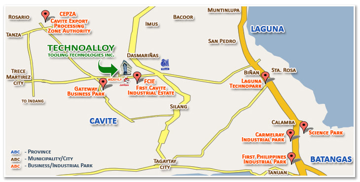
Technoalloy Tooling Technologies Incorporated
Technoalloy Tooling Technologies, Inc. is an industrial corporation that supports the semiconductor and electronics industry. The map shows that its target audience are businesses and industries near Laguna, Batangas and Cavite. It is a modern production facility that was established nearby establishments and processing zones.
The corporation is highlighted as a building as it symbology, supplemented by a green arrow and the logo. The roads are in yellow and are in varying degree depending if it’s a major road, national road or just an access road. Other features are indicated by red points showing the bias of the map maker and the corporation to the needs of their customers and possible customers such as industrial and technoparks, industrial centers and estates, and other related processing establishments and authority.
The map is somehow poorly executed and there are some things that are still needing to improve. The absence of north arrow and inset map makes it hard to know the orientation and direction of the map. The surface is again assumed plain and because of personal interests, major places and establishments are being shown as landmarks but I think there is not enough. The roads being shown are those with access to the establishment only. In terms of legibility, the use of mask highlighted the labels and the use of different colors indicating the provinces, municipalities/cities and businesses and industrial parks was good however they do not follow the convention on labelling. Lastly, the lack of at least municipal boundaries makes it hard to demarcate if the corporation is actually located in Cavite, Laguna or Batangas. The use of symbology in the map, although successfully showing the points and its objective to show the exact location, also fails to connect and convey the message of what they really do or what they are as an establishment.
Vicinity maps or location maps have been integrated in our daily lives. Even just by using Google Maps is just like using a vicinity map. You try to zoom in or out to the intended area and the Google Map then shows you other points that are related to what you are searching and hiding those which are not possibly in your interest. We can see these maps a lot however to properly locate and give efficiency and convenience in locating places, it is important to create a comprehensive and easy to understand vicinity maps that are not confusing and serves their purpose well to avoid being lost.
Although vicinity and location maps are slowly adapting to the modern technology of Google Maps, the essence to create a map that would effectively convey message and purpose is still important. Most of the vicinity and location maps are usually made by advertising and marketing designers without much foundation in mapmaking or the elements of maps at least. Thus, it is important to spread geographic literacy to improve the services available in these aspects.
Although vicinity and location maps are slowly adapting to the modern technology of Google Maps, the essence to create a map that would effectively convey message and purpose is still important. Most of the vicinity and location maps are usually made by advertising and marketing designers without much foundation in mapmaking or the elements of maps at least. Thus, it is important to spread geographic literacy to improve the services available in these aspects.
