Fly, fly and away
Being interested in tourism and the mobility of tourists across the world, it has been always amused me how much people move from place to place and how easy the mobility since the first airplane was made. Airplanes are just one of the technologies that challenge the distance decay function. It also play an important role in the spread of ideologies, goods, services, and diseases even. Movement and transfer to one place to another is easier than before regardless of the distance.
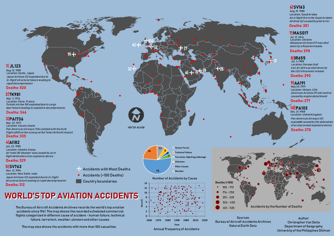
Unfortunately, airplanes are also prone to malfunction and accidents. Ever since, several state governments, private agencies and international organizations work hand-in-hand to ensure the safety of the aviation sector. However, every year, there’s still a number of cases of accidents that occur. In 2018 alone, The Guardian and BBC News have recorded more than 20 cases of plane crash and aviation disasters around the world. Before October ended, Lion Air Flight 610 became a headline killing 189 passengers and crews from a take-off accident in Java, Indonesia. This map aims to map the world’s worst aviation accidents and to look at the pattern of aviation disasters spatially.
The Bureau of Aviation Accidents Archives (B3A) was established and based in Switzerland. It was founded Ronan Hubert in 1990 in the purpose of providing database of all information related to aviation accidentology. promoting aviation safety through know-how action plans, training and information, and inform the public and professionals of the risks inherent in the operation of an aircraft and training on psychological preparedness for mass disaster (B3A, 2018). The database website features a database of almost 25, 000 events that can be categorized and filtered into several combination. For this map, the data obtained from the database are limited to scheduled revenue flight as flight type and is bounded by events which has equal or more than a hundred casualties. Through another filter, the events are then categorized in their cause, either human failure, technical failure, terrorism, hijacking and sabotage, weather, unknown and other causes. Besides providing the picture of the plane and the crash event, the database provides information on the date and time of the accident, location, flight and plane registration numbers, flight type, detailed cause of accidents and the number of survivors and casualties. It is however not providing the coordinates thus, Wikipedia was used for the coordinates counterchecked from a website called Global Incident Map (aviation.globalincidentmap.com).
Initially, my plan was to identify the countries with the greatest number of cases of accidents and comparing the frequency of accidents between domestic and international flights. However, at the middle of making the map, it realized me that although it might be possible, I am constrained by the time and sources I have available. It was just too big for me. So I started narrowing down my ideas and data. From the database of 25, 000 events, I stripped the data into scheduled commercial flights and having at least 100 casualties. It was a challenge to create a list form since the database available cannot be downloaded thus a manual type of creating the database. I sorted out from the available information the things that I needed such as flight numbers, location, aviation service providers and their base country and the number of deaths. I identified the 10 events with the most number of deaths then, I plotted the points in the map having a separate symbology for the 10 and the other points. I also included another map showing the number of deaths in every listed cases. To provide a better analysis, two graphs were provided showing the number of accidents in each type of cause provided by the database and the distribution of events every year.
The most challenging in the making of map was to think and execute a good and balanced layout. It was a challenge for me not to overcrowd my map with information, and especially in providing a balance in colors. Also, before doing the map, it was a challenge for me to think of the significance of the concept. The most exhausting challenge for me was to finalize the database and sorting the information manually – whether or not the information is relevant to be included in the map or not.
As an advise to other map enthusiast who plans to engage themselves in creating their own map, it is important to consider your interest and that you are at least well aware of what your map will be about. It is important also to seek for help especially in looking for sources of data. It might be very challenging to obtain the related data however, you must have grit and learn how to adjust accordingly when the resources is not available. In creating the map itself, you can start from sorting all the relevant data and information needed in your map and look for an appropriate layout that will emphasize the information you want to convey. Choosing the right colors are also important. You must take time in choosing because it will be one of the basis whether your map will be engaging enough or the information is shown effectively. Lastly, make sure to enjoy and appreciate the learning process. That is just your first map, and you can have more!
