The map portfolio would present 10 different maps of the United States of America that give a cartographic representation of the country’s demographics and population distribution. Demographics in the United States could be presented through population change, population density, immigrant population, age population, and people’s incomes. The portfolio could also present maps showing the different cultural preferences of Americans, touching on different aspects of their way of life.
The portfolio is inspired by previous collections of maps about the demographics and culture of the United States. The portfolio aims to present a more coherent and integrated set of visual representations of the country that will look at USA in another meaningful way, not just through the typical physical and geopolitical maps. The goal is for the portfolio to make cartographers realize that mapping a multi-cultural state like the United States should not be limited to the conventional reference maps. Mapping should also be a way to present different themes and aspects of a particular space that can connect to different kinds of people.
Different sources would be used for the portfolio, such as the ones listed below. Most of the maps would come from collections of maps about the United States. The maps will be handpicked to fit the theme to be used. Interactive maps may also be used to showcase a more detailed understanding of the theme.
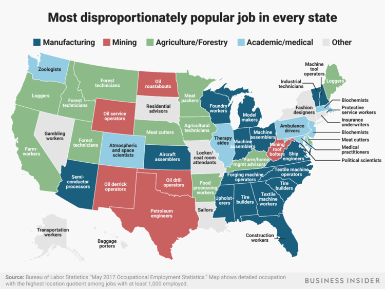
The map shows jobs that have a bigger share in total employment in a particular state than they do in the US, instead of showing the most common job in each state because 38 states would state the same job – retail salesperson. This map by the Business Insider map shows the job in each state with the highest location quotient among jobs with at least 1,000 employees in the state. In my opinion, having more variety with the theme “most popular job” is better than showing a map with more or less the same job. I also observed how there is some sort of clustering in job sectors such as manufacturing jobs being the most popular kind in the southeastern US and agricultural / forestry jobs in demand in the western United States. I appreciate the map for not having any associations with monetary benefits, meaning this map does not base the most popular job with the highest paying one. Job popularity could possibly translate to two things – the job could be the most fulfilling one (the one based on people’s passion for work) or it could be the most widely offered job. In summary, different occupations are not evenly distributed among the states; instead, some jobs are concentrated in particular states due to people’s preferences and the different cultural, economic and social backgrounds of the people in each state.
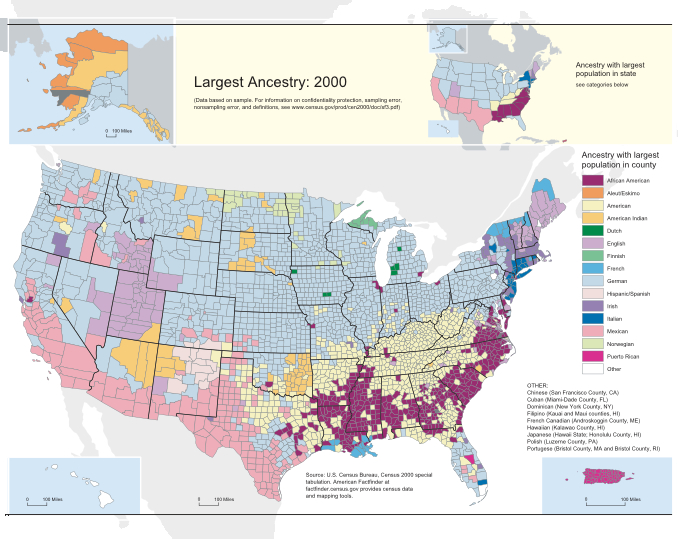
The map shows the ancestry with the largest population in each country in the US. One of my critiques in the map is about the true American ancestry. This might stem from my idea that the native population of America are the Indians, that before the Indians came in the continent, there were no permanent settlements and population in the area. The map also illustrates how there have been many different kinds of ancestors who came from Europe, which is linked to America’s history of being explored by different ethnic groups and ancestries. Based on the map alone, I would say that the purpose of the map is to make its intended audience (eg. Scholars and US citizens) realize that different ancestries dominate the US population, not just the English and the Indian ancestries. It turns out that German is the ancestry with the largest population in most states, focusing on the northern and central US. Mexican ancestry prevails over the US states that border it, while there is a mix between American and African-American ancestries in the southeast. I could see through this map how there is diversity in the origins of American people in terms of ancestry and ethnic background. But an interesting thing to note from this map is the effect of modern-day immigrant populations when it comes to the addition of ancestry categories in the future.
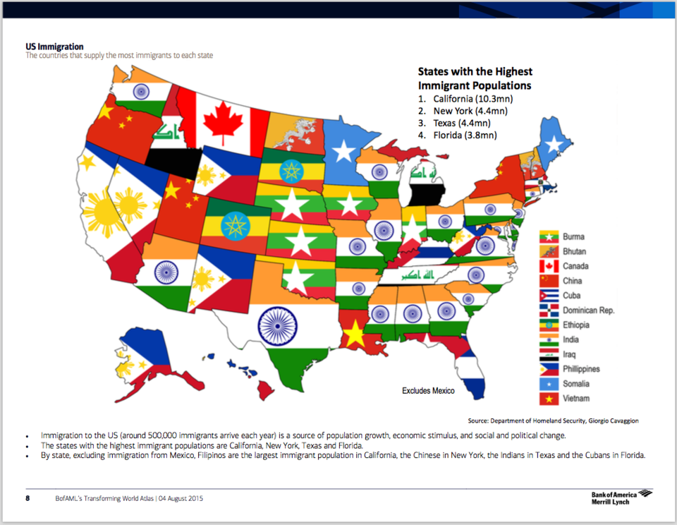
This map shows the country, other than Mexico, that is the most common country of origin for immigrants living in each state. Asian countries, including Burma, China, India, and the Philippines, are among the common countries most representative of the immigrant population in certain states. It was a surprise for me to see my native country, the Philippines, to be the top immigrant population in 7 out of the 50 states (if you exclude Mexico, based on the disclaimer). This could mean that more and more immigrants from the Philippines are residing in the United States. In fact, the United States is the Philippine’s top OFW destination, with 3.4 million Filipinos working there for better chances of financial stability and secured social welfare benefits. But this phenomenon of more and more Filipinos migrating to the US for more life benefits promotes the idea of “brain drain” – wherein there are more opportunities taken outside the native country. I also noticed that most of the countries are Asian, which supports the idea of districts and communities made for these countries, such as Little India and Chinatown present in major cities. The map makes us see how Asian populations are being represented in the US, giving us a sense of how the cultural minorities have become part of the American culture, gaining recognition despite certain differences with the majority.
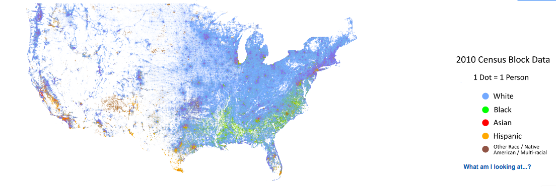
This is a racial dot map of the United States, where one color dot represents one person. The map’s visuals which include multi-colored palettes really make it look interesting. The colors accentuate the presence of different races in the country. There is also a stark contrast between the display of colors in the west and in the east, due to the great amount of settlements and major cities found in the eastern US compared to the western US. The map also illustrates the concentration of white people in the northeast and black people in the southeast. Certain color combinations are also visible when the map has been zoomed out, such as purple with the mix of White and Asian, as well as green-yellow with the mix of Black and Hispanic. This could probably mean even more mixed races that arise from interracial relationships that exist within the multi-cultural nation of the United States, in addition to the brown dots that represent multi-racial people. This map further supports the variety of races, ethnicities and cultures found in the US. But it looks to me that certain data might have been missing in the western US, because of the scattered colors not becoming much coherent. Although this could be supported by the idea that not much civilizations have been formed there due to the extreme variations in the physical environment.
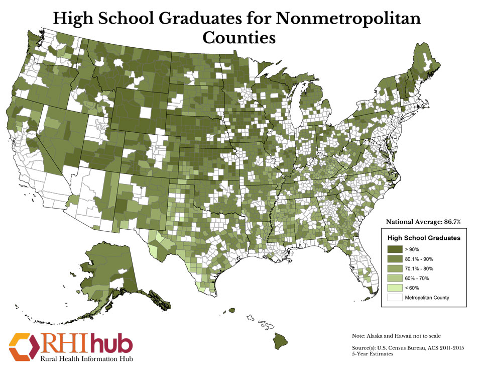
This map shows the population percentage of high school graduates in each US county. This map is notable for excluding metropolitan counties, taking into more consideration the state of literacy in rural areas of the country. The national average is 86.7%, which is relatively a good percentage coming from the rural. My main criticisms on this map lie in its scattershot look due to metropolitan counties being excluded. This is because the data become discontinuous, making us keep our attention only on the shaded areas. Another would be the position of the two outermost states, Alaska and Hawaii, in the map. An inset map for the two states could have been a better way to present them, instead of simply inserting them at the bottom of the map where they are not really supposed to be relatively located. The map is interesting for showing, in a gradual / graduated manner, the differences in percentages in literacy for each rural county, giving us a sense of the lives that people live in this area. Some people would probably just choose to work on the farm and never get to graduate, while others pursue college in the hopes of getting another line of work.
