road crash incidences in metro manila
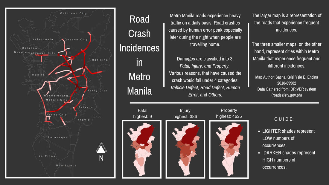
I created the map to be able to visualize roads that experience the most road crash incidents. The data I gathered came from various surveys readily found online. Most of which, came from Rappler but I was unable to find ways to properly represent them. What made it hard for me to use them --- they all contained different information. Most of which, although numerical, were barely spatial. The data that is found in my outputs are just incidents that were reported to the DRIVER system --- a site where LGUs can input incidences and plot them onto a map online. They aren't exactly the complete number of actual incidences. I wish I got more information on that but that information is too sensitive; it might have included detailed reports on the said incidences and it would have been too tedious to have to compile everything if it weren't readily available.
To make the larger image, I manually drew the lines. I based it off the screenshot of the data I wanted to use for this output. It's not perfect, but it does represent the roads that experience a lot of accidents. The smaller maps, I used graduated colors for it. It's basically the use of colors to describe intensity or number/ranges.
For beginner mappers:
The hardest part of making my individual project was collecting the data. I already had a map in mind, I knew what to use. Alas, the data did not allow that. And that, I think is the limitation. I realized that making maps isn't a simple job. It doesn't just involve data that already exists. Sometimes, you'd have to make your own sets. Sometimes, changes are good. Always analyze your data. Playing around with it would help you get the feel of creating it and it would make things a whole lot easier if you knew how to navigate around the software. Lastly, enjoy. Play with the colors as well, have your own unique touch to your map. <3
