
Ownership of Brands Worldwide
(https://i.imgur.com/wN8Vhfr.jpg) All too often, consumers are faced with the dilemma of choice when out shopping for goods and services. We never really think about how our purchases make one manufacturer richer than the other, but for businessmen, maintaining this illusion of consumers’ choice is what helps their corporations stay afloat. This organizational chart shows hundreds of the world’s most ubiquitous household brands. They are all grouped into clusters by type of product, and are then linked towards one larger parent company. The creator of this chart probably wanted to show ordinary people worldwide that many of the brands we buy today are ultimately owned by ten multinational corporations. In many ways, all the products we buy are somehow connected to each other through a series of corporate buy-outs, mergers, and acquisitions that have taken place over time. What used to be small individual enterprises have either been purchased by larger competition or fused into an existing brand. The chart is a very effective means of making the complex system of corporate ownership and subsidiaries understandable to ordinary people. 
Map of European DNA Haplogroups
(http://i.imgur.com/GLL0M9y.png) This map of Europe features proportionally-sized pie charts for each country that show the predominant DNA haplogroups of their population. Along the margins of the map, there are explanations for what ethnicity each of the haplogroup codes describe. Moving throughout Europe, it is evident how countries adjacent to each other tend to have similar-looking pie charts compared to those that are farther away. This is significant because it shows how two neighboring but frequently warring nations are actually genetically alike, and how two different countries that consider each other to be foreign are actually much more similar than they believe. In a historical context, the absence of technology to identify haplogroups meant that societies in the past conquered and waged war purely on the basis of nationalism and pride. Had they been aware of the incredible similarities they all shared in their DNA, perhaps the outcome of history may have been different. While this map can also serve to unite Europe, it also confirms many of the differences we know to be true today. In the West, the red color representing Celtic groups is dominant. Moving eastward, this haplogroup wanes in favor of the Nordic haplogroup (in Scandinavia), the Slavs (in Eastern Europe), and Arabic haplogroups (towards the southeast). It is an easily-digestible map that would be of great use to any enthusiast of social sciences and even of human evolutionary science. 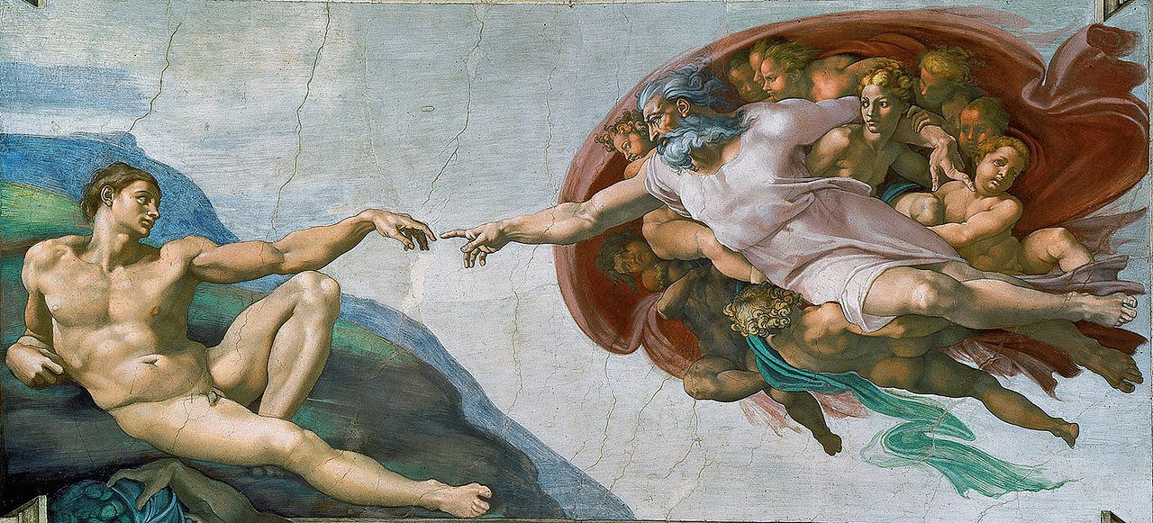
The Creation of Adam (Michelangelo mural painting)
(https://en.wikipedia.org/wiki/The_Creation_of_Adam) Italian Renaissance painters such as Michelangelo placed a premium on religious themes, and they largely romanticized the connection between human beings and their creator. One of Michelangelo’s most iconic works was Creazione di Adamo, or the “Creation of Adam” in English. It is a mural painted onto one of the ceiling panels of the Sistine Chapel in the Vatican City. It shows God in human form, floating in air and held back by his horde of cherubs, reaching forward to touch the finger of Adam who is naked and laying on the ground. Beneath the ground, there seems to be a grim-looking arm and darkness. The obvious divisions between God in the air, Adam on the ground, and a seemingly-restrained creature in the underworld is a beautiful example of how artists recognized the symbolic importance of spatial differentiation. Each different space was home to its own kind of being. The touch between the fingers of God and Adam is a symbolism of the life-giving force used in creation. From an Abrahamic perspective, all humans descend from Adam. Thus ultimately, the painting shows how mankind is connected to God. As the centerpiece in a series of panels high above the Sistine Chapel, its spectators would immediately be drawn to its powerful representation of the relationship between God and man. In studies of culture, we often only acknowledge the relationships between different groups of people and fail to recognize the importance of supernatural elements. This painting is a reminder that we are all connected to each other through God’s life-giving force, at least from an Abrahamic perspective. |
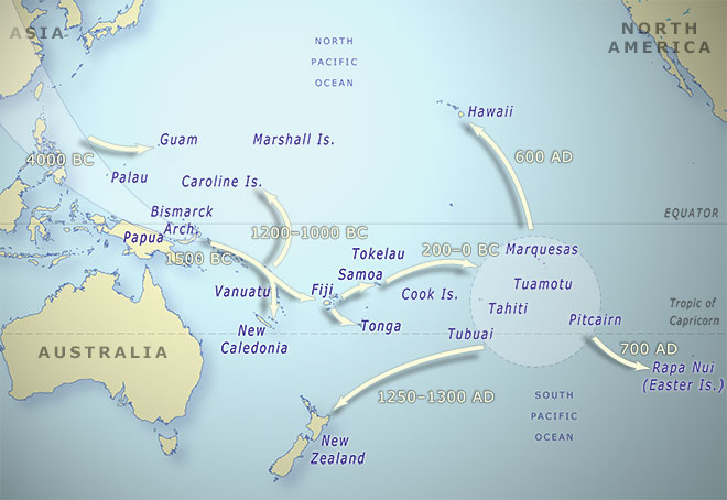
Map of Pacific Migrations
(https://teara.govt.nz/en/map/1449/map-of-pacific-migrations) One of the greatest feats of mankind was the population and settlement of the remote islands of the Pacific Ocean. It is a topic of interest not only for geographers, but also for anthropologists, historians, linguists, and even engineers. This flow map published online by the government of New Zealand shows the migration route of Pacific island settlers from Asia towards the Pacific islands, as well as the approximate years of those movements. Since moving out of Africa, the human species took thousands of years before reaching continental Asia. But within intervals of a few hundred years, that population of humans developed advanced maritime technology and knowledge that enabled them to hop onto maritime Southeast Asia and out into the islands of the Pacific Ocean. While probably difficult a figure to ascertain, it would have been ideal if the map featured flow arrows proportional to the estimated size of populations that moved throughout each migration wave. What I really appreciated was the inclusion of the approximate years that the migration took place. It is stunning to think that places like New Zealand were uninhabited by people as late as the 1300s. The inclusion of continental landmasses in the map, such as North America, also help ordinary viewers to realize the sheer scale of these voyages. A short commentary on the map’s website also describes how these early Polynesians set out on deliberate voyages of discovery on mere canoes. It is a testament to the formidable human spirit, and it ultimately shows how every human being is connected biologically through a series of migrations and settlements. 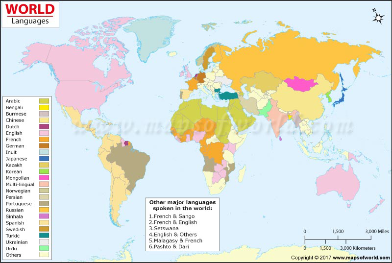
World Language Map
(https://www.mapsofworld.com/world-language-map.htm) During pre-colonial times, the different parts of the world enjoyed a great degree of linguistic heterogeneity. The lack of transportation and communications technology meant that interactions between differing ethnic groups were kept to a minimum. However, as human society advanced and empires were built, many languages fell extinct to more dominant ones. This map shows the major language spoken in each country in the world. While it fails to show information for the smaller countries (as a result of abstraction due to its global scale), it gives the reader a general idea of which languages are most-widely spoken throughout the world. There are large swathes of the earth’s landmass where English, Spanish, Arabic, and French are spoken. Because of their countries’ size, Russian and Chinese are also given unintentional emphasis. Coincidentally, these six languages also happen to be the official languages of the United Nations. While it is highly exclusionary, for the sake of practicality it is easier for citizens of other nations to become proficient in one of these languages in order to access a wider range of international opportunities. The realities of language shown in the map also reflect the legacy of colonialism and the continued prevalence of language as a powerful political tool. Despite being divisive, it also shows how different countries can cooperate together on the basis of a shared linguistic heritage. Such communities do exist, such as the Francophonie for French and the Commonwealth for English. This website could be improved by perhaps showing individual continent-scale maps showing the dominant languages per country, particularly in Asia where native languages largely survived despite colonialism. |
